Your work as a visual artist goes from museum art pieces to international architecture, and it often dissolves the boundary between architecture, sculpture and painting.
How did you approach colouring furniture that are objects that are being moved around and must be able to be used in different spatial contexts?
The four new colours for the Cross Chair Tube are mixed by different colour shades, forming a wider range of colours that can be included in various contexts without sticking out and taking over the attention. The colours appear in a spatial hierarchy where they should be present but at the same time, they should not make too much noise. Each colour serves many different occasions by adding warmth and also atmosphere.

For this new colour scheme, you have deliberately avoided working with seasonal or fashion-based colours, ensuring that the colours have the potential for a long aesthetic life – just like the furniture. How did the colours come about?
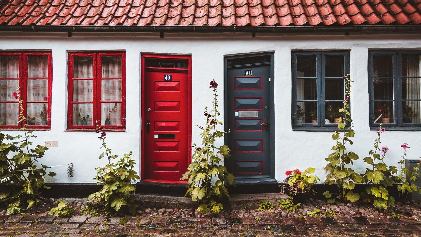
The colour palette for The Cross Chair Tube is based on four classic colours we know from the Danish architecture and its colour coating, highlighting the woodwork. We may recognize the nuances but in their new interpretation and context they take on a different expression. Some of the few classic pigments (Iron blue, Copper red, Chrome green and Lichen green) that were often present in the past can now bring something classical and historical into the contemporary space of the new Cross Chair Tube. (The recognition of colours can revive forgotten levels and by placing them in different connections can lead us to new experiences.)


The colours that you have developed are influenced by light and are quite evocative. Colour choices tend to be individual and very personal.
How do you develop colours that can appeal to many, and at the same time ensure that they do not become indifferent? How was your overall approach to this?
When I work with colours in spaces and functions, my first consideration is what context the colour will be included in? There will always be some cultural and historical aspects associated with it and it is a great place to start for the colour choice and technique. There are recognizable aspects and at the same time, we can reinterpret or re-actualize forgotten levels. When a specific colour and shade are moved to a different place, something new happens in our experience. It is in the mixing of the colour shades and their context that the life of colours is formed. Colours are never experienced alone, they are always experienced in a context.

A chair is something else than a large wall or a floor surface. It has various components, including upholstery which might be incorporated in a different colour.
How did you take this into account when developing the colour scheme?
The painted surface of the chair must follow the shape of the object and function above the floor surface as a complete seat and in connection with the textiles. The colour combinations in surfaces and textiles can expand the spectrum further and you can accentuate or mix variations in expression.

We have selected several textiles that can be combined with the chosen colours so that the user can choose and still be sure that the textile and chair fit together. The textiles and colours are carefully chosen so that textures and colours support the design of the Cross Chair Tube. It is a delicate balance to ensure that the chair retains its personality but at the same time adds a new expression.


